ROMA
El Amor de Una Familia
A Family’s Love
Roma (2018) is a film by Mexican Director Alfonso Cuarón released in 2018 on Netflix. The film explores the themes of social classes, the reality of the working class, and the personal struggles of Cleo as she struggles through pregnancy.
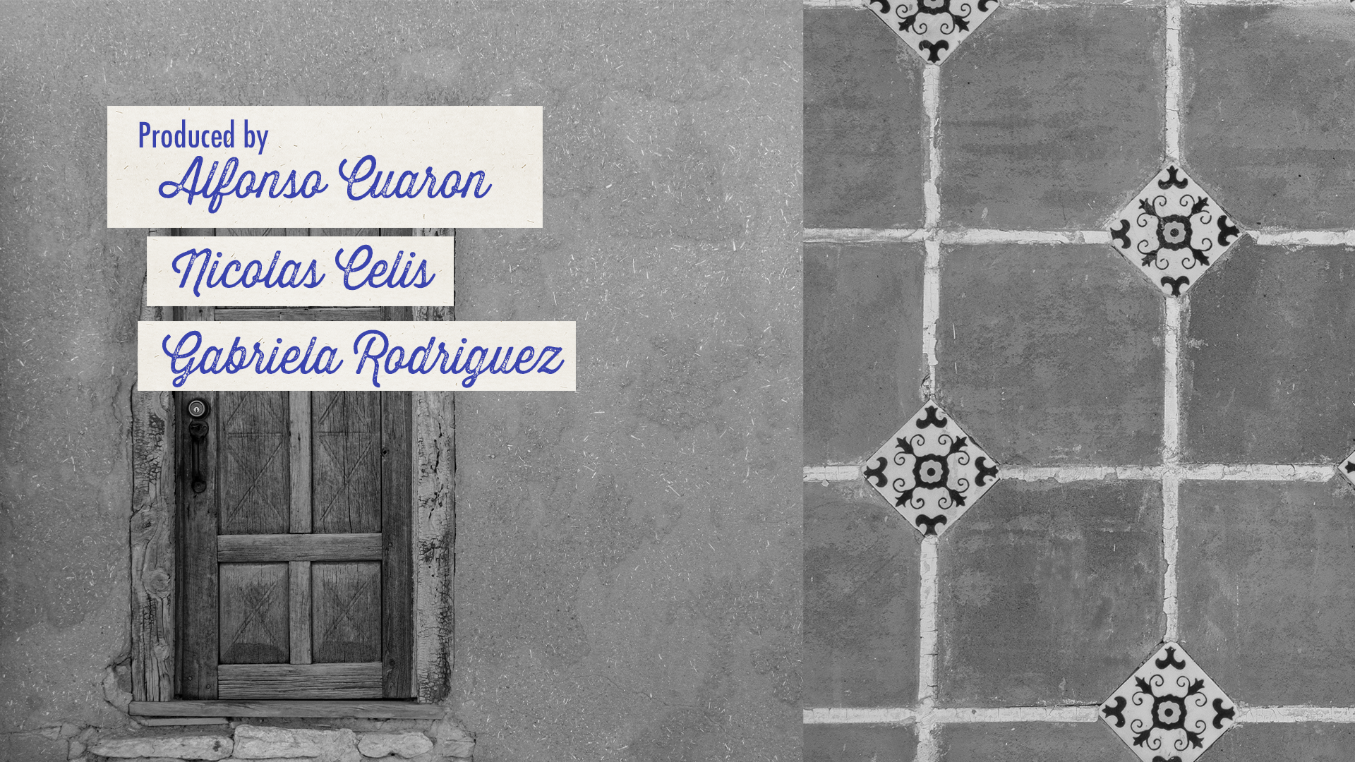
The sequence acts as a window for us, the viewers, to see the truth behind these wealthy and privileged families. From affairs to the student marches of Mexico City, the film explores how, under the gold colored Roma, there is a heart-wrenching and difficult reality that every family faces. So, the title sequence will hopefully act as that window. The concept is to look through the glass and peel back the facade that the home carries.
Concept
The film acts as a window for us the viewers in seeing the truth behind these wealthy and privileged families. From affairs, to the student marches of Mexico City, the film explores how under the gold colored Roma, there is a heart-wrenching and difficult reality that every family faces. So, the title sequence will hopefully act as that window. The concept is to look through the glass and peel back behind the facade that the home carries.
Typography
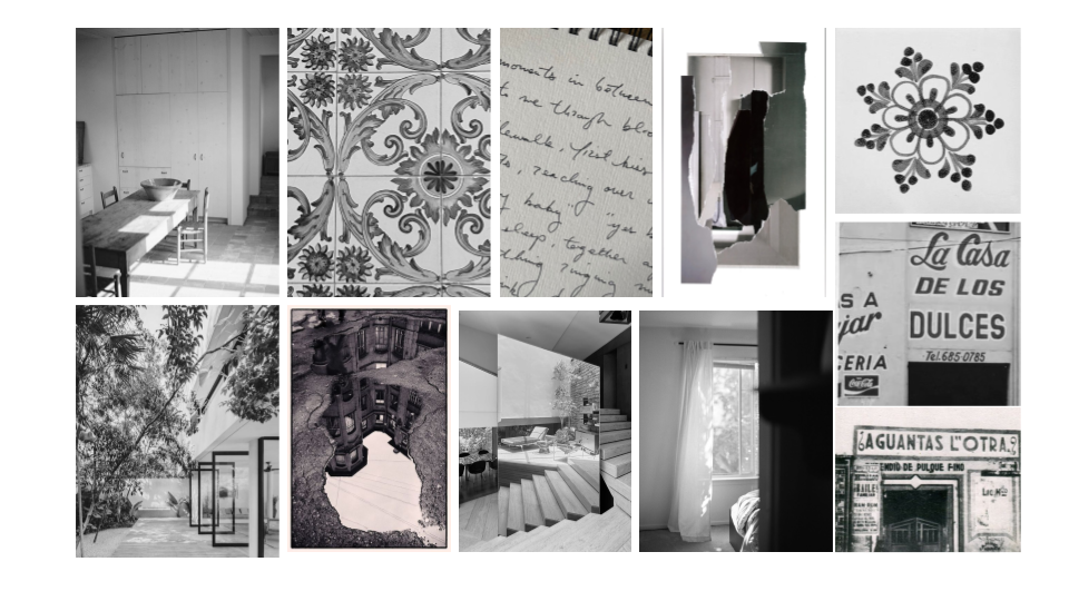
Typography explorations helped hone the tone of the sequence. Looking into Mexican design around the 1970s, sans-serif fonts where coming into style, notably with the olympics and media advertisements. Futura was chosen for that simplicity and minmal look.
For the headings, the goal was to bring back cursive and a handwritten feel. The film acts as a love letter to Director Alfonso Cuaron’s childhood, so the main typeface had to reflect a more romantic and nostalgic feel.
Style Frames